Component Libraries That Work

SCALABLE DESIGN SYSTEMS
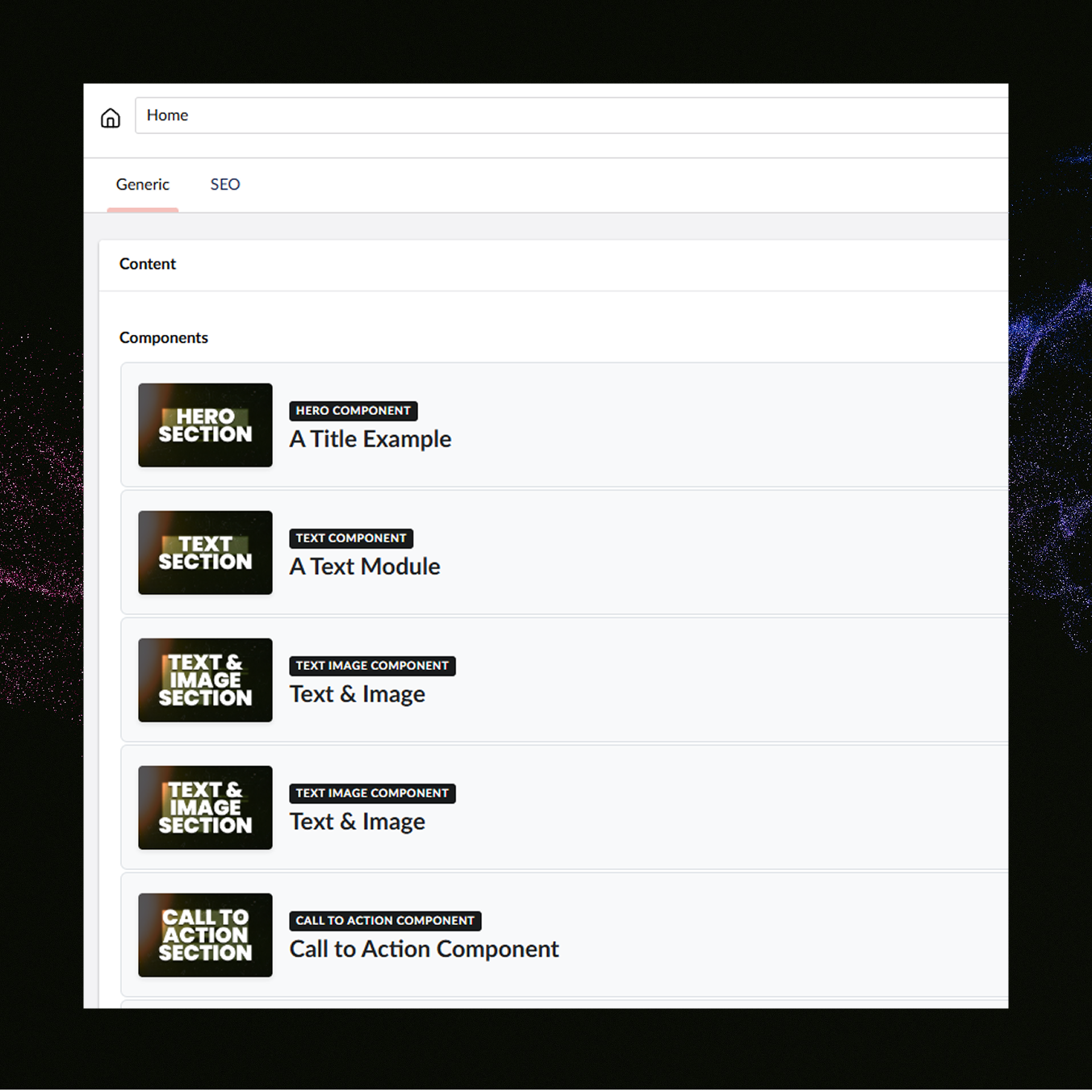
Custom component libraries transform how your team builds and maintains your digital presence. Instead of rebuilding the same elements across every page or project, I create modular design systems where each component is built once, tested thoroughly, and reused infinitely—maintaining brand consistency while accelerating development.
Every component—buttons, cards, forms, navigation, content blocks—is built once with clean code and clear documentation. Your design system becomes a living toolkit that adapts seamlessly whether you're launching new pages, building microsites, or expanding platforms.
Faster development, fewer bugs, consistent experiences, easier onboarding. Your brand stays cohesive across every touchpoint while your team moves at speed. It's the foundation that lets you scale without chaos.
Components that adapt, systems that endure
Design systems aren't just about consistency—they're about flexibility. Every component I build is designed to adapt across contexts while maintaining your brand identity.
From simple UI elements to complex content blocks, each piece is built to be reused and repurposed. Your toolkit works today and scales tomorrow, whether you're adding new features, launching new pages, or expanding to new platforms.
Built right once means built right everywhere.